Oregon changed the football style game forever. Continuously evolving, always innovating, your favorite team's favorite team, the Ducks have set the pace in uniform design for 30 years.
Oregon has style and panache and colors that pop. Many of the looks are iconic. The snowy-white stormtrooper uniforms that shocked Michigan and steamrolled the Huskies. The chainmail sets that set football on fire in the J-Stew/Dennis Dixon years. The Flyin' Hawaiian flying in wings.
The Ducks wore silver wings in Lubbock and dazzled in throwbacks. Every uniform reveal gets a thousand retweets. The shoes are coveted by superstars. When the Ducks set out to stomp out cancer, their version of a black and pink jersey kicks cancer's butt.
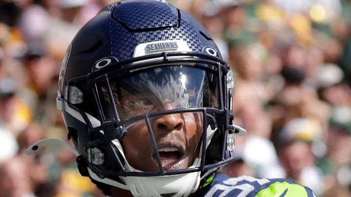
So it was a pathetic case of me-tooism when the Seattle Seahawks, looking to make a name for themselves in the NFL Rivalries Series, came up with a design that looked embarrassingly familiar.
Does it look like an Oregon jersey to anyone else? pic.twitter.com/cTAsPDPyPo
— SleeperSeahawks (@SleeperSeahawks) August 28, 2025
Really, Seattle? Why not something in a gold helmet with a "W" for winning, some kind of tribute to state pride? Imitation is the sincerest form of flattery, but this look is such an obvious effort to mimic the cool kids that Steve Largent and Cortez Kennedy would be ashamed to show up at the stadium.
The Seahawks have long tried to be the Northwest's team, but there are probably as many 49er and Charger fans in the Willamette Valley, in spite of years of having the lackluster Seahawk matchup dominating our airwaves. Rarely has Hawk pride been a real thing south of Vancouver.
It just doesn't resonate and this latest copycat stroke of uniform envy doesn't cut it. Seattle, don't try to be the Ducks. There's no substitute for the original.
The Oregon Duck is the greatest mascot in the history of this planet. I will take no arguments on this pic.twitter.com/WoHBtF0DUO
— Fightin Amish Captain (@BoSoxJason) October 12, 2024
