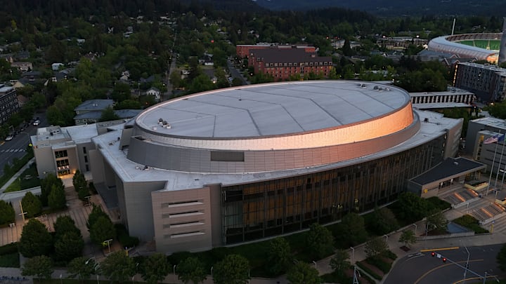
There's a brand new design in Matthew Knight Arena. The Oregon basketball court, famous in recent years for having the iconic (and slightly controversial amongst critics of graphic design elements being used in intriguing ways) has been refreshed officially!
And, as with all things ever, folks have opinions. And they like to share said opinions on the internet. Some of those opinions even came from Oregon basketball fans (which is 100 percent relevant to the fact that it's an Oregon basketball court design). So, let's focus on that for a moment.
What are Oregon Ducks fans saying right now about the new Oregon basketball court design in Eugene, Oregon?
Here's what Oregon basketball fans think of the new design:
New Oregon basketball court design at Matthew Knight Arena: Ducks fans sound off
I think they are trying to do too much. Simpler themes. You can’t put all the references in.
— 🇺🇦🇺🇦cary mallon🇺🇦🇺🇦🚲#🟦 (@cmal1102) June 24, 2024
They most certainly can put all the references in. Should they? I mean, that's a completely different question. But they absolutely can.
Those details are very nice
— craig stolarczyk (@craigstolarczyk) June 24, 2024
All of those references do make nice details, you know?
u just couldnt get rid of the trees
— 🦆 (@ducksnix0) June 24, 2024
Trees forever, man.
Should’ve been real trees imo
— 🦆🌹⚡️ (@ClassyDuckFan) June 24, 2024
*checks notes*
Uh... Wood, is, you know, made from trees. I think. I have a degree in forests and last I checked, trees make wood?
Okay y'all kinda cooked 🤌🏻🦆
— scooo🦆 (@yami_ven6m) June 24, 2024
I 100 percent agree with this take. It's great. This floor is solid (not just in a literal sense, folks).
Look, I think this is a great design (I also really liked the old court styling as well, but I understand why some folks weren't necessarily fans of it). There's enough uniqueness that helps separate the Oregon basketball court design from what is more commonly found elsewhere in college basketball design elements.
On top of that, the fancy design elements become a bit more subdued in some ways. It's a really good compromise between the conventional feel and forward-thinking design elements without leaning too hard in either direction.
You still get the fun and brilliance that makes Oregon athletics branding stand out in so many ways while also getting a bit of the traditional vibe for Oregon basketball fans that just want to watch a game without being totally distracted by beautiful art on the court. It's not too traditional. It's not overly in your face with any specific element.
Kudos to the folks behind this one. They did a fantastic job.
